This first post details the the 12 principles of animation.
This is the pose-to-pose animation, where the character jumps off a building. Pose-to-pose involves moving the character to and from the major points, and then having them transition between them.
This is timing and spacing for weight. Originally, the character would lift both the weights at once, so I had to go in and add a delay on the heavier weight, to make it more real.
This is timing and spacing for readability. It involves lengthening and shortening parts of the animation to make the animation more believable. In this one, I gave the character a longer buildup before he punches.
This is timing and spacing for contrast. It involves changing the timing of key events so the viewer can get a better idea of what's going on.
This is follow-through and overlapping action. Follow through and overlapping action make this rope swing more realistically.
The previous two images are on keyframing follow through and overlapping action. There's a lot of things you can tweak to make things more realistic. In these two, I started by setting the key spots the rope should swing to, then adjusted the frames between them.
This is from the tutorial on secondary action, which involves animating things that aren't the main focus to make the character more lifelike.
This is from squash and stretch. When the character moved his finger down, the jello stuff below him would have to maintain its original volume, so I shortened it and bulged the sides. When he lifted his finger, I did the same in reverse.
This is applying the squash and stretch principle on characters to make their important actions more exaggerated.
Here is adding exaggeration to a face to make it more appealing to see. When you exaggerate facial features or expressions, it makes it clearer as to what the character is feeling or thinking.
The previous two images are dealing with arcs in character movement. Viewing and modifying movement arcs can help you correct problems, or increase realism.
This is anticipation for building up an action. It is similar to timing and spacing, and in this tutorial, I gave the character more buildup time before punching.
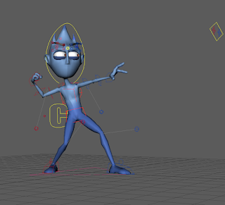
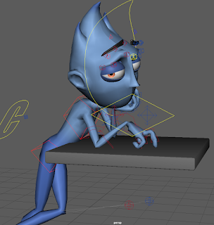
This is adding personality and emotion to the character. Every good animated character has a believable personality. In the first image, the character is accusing, in the second one he is bored.
Here is staging. Staging is where you make the camera move with the important actions, so in this tutorial, the camera follows the character walking, then cuts to when he steps on the rake, then cuts again to his face being hit with the rake.
This is for the tutorial on solid drawing, which helps you identify problems in your animation, or spots that could look better. It's important to check animation frames to make sure it will look good, since when you spend time working on something it can be easy to overlook it's flaws.
Overall I enjoyed learning the beginnings of animation, though I personally am more interested in creating the environments and characters that other people will animate.
My 3D Modeling blog can be found here.
My Digital Sculpting blog can be found here.


